Data Viz Made Simple with Kristen Sosulski

Listen to the Episode

Subscribe to the Podcast

Episode Summary

If a picture is worth a thousand words, then a data visualization must be worth far more than that - Dave Mathias

Meet Kristen Sosulski. She’s an Associate Professor of Information Systems and the Director of Learning Sciences for the W.R. Berkley Innovation Lab at New York University’s Stern School of Business.

Kristen also recently published a book about data visualization, “Data Visualization Made Simple, Insights into becoming visual”

Kristen is an absolute expert on Data Visualization and teaches data viz best practices for both NYU students, as well as through a certificate program. Her passion is in helping up-and-coming analysts use visualization to enhance their work, tell stories, and communicate effectively with data.

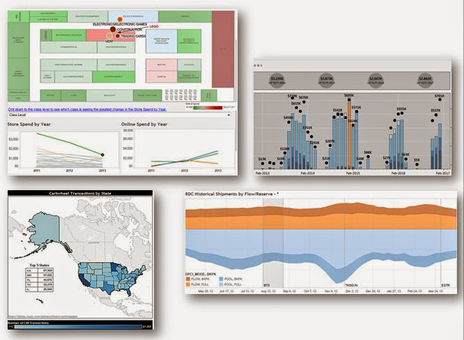
Data visualization is important because we can use it to:

1) Explore our data and understand it

2) Communicate well, especially with non-data-literate people

In the former, when you’re exploring your data, you want to use more rudimentary visualization tools like scatterplots and trellis plots. These are great for understanding variation or differences between dimensions. But they are pretty terrible when it comes time to present your findings.

Don’t make your audience work too hard
— Kristen Sosulski

For the latter, when using data viz for communication, stick to simpler methods like bar charts, line graphs, and maps. Preattentive attributes, highlighting the thing you want someone to focus on, is a really effective way to keep someone’s attention.

So how about highly designed visualizations like Infographics? Kristen wouldn’t say “no”, but she certainly wasn’t wild about them. The problem is that they tend to over-simplify the data that it’s trying to communicate. That said, there are some great design concepts that we can use from infographics when creating powerpoints and other presentations.

data visualization made simple kristen sosulski.jpg

While we cover some in-depth topics, it’s clear that data viz is for everyone, not just data science. Kristen covers the 4 categories of data viz tools, from basic excel or powerpoint, to advanced like R or Python.

We also wanted to learn more about Kristen’s new book, “Data Visualization Made Simple”. In chapter 6, we learned about ways to maximize retention of the reader. A critical piece to this is EMPATHY and being in-tune from your audience. You may go as far as drafting a survey so that you can understand the potential reader and make sure you’re designing to their needs. Don’t make your audience work too hard.

We wrapped up our conversation, talking about the future of visualization, and discussing how things like augmented reality and AI are already starting to change the game for data viz.

Thanks for coming on the show, Kristen!

More about Kristen

Resources and Links from the Episode


How to Data Viz like a Pro Part 2

Listen to the Episode

Subscribe to the Podcast

Episode Summary

If a picture is worth a thousand words, then a data visualization must be worth far more than that.

In Part 1 of our two part series on data visualization, we talked about GOOD visualizations, what types of visualizations work better, when to use them and the like.

Today we’re talking about BAD visualization. When data viz goes wrong. And of course we have to start with the PIE CHART. As a wise friend once told me, “If a chart is named after food, then I don’t like it”.

If a picture is worth a thousand words, then a data visualization must be worth far more than that - Dave Mathias

If a picture is worth a thousand words, then a data visualization must be worth far more than that - Dave Mathias

We know lots of people don’t feel the same way about pie charts, so we wanted to discuss a bit about WHY it’s not a great tool for helping you tell your data stories. We won’t say you can’t use it, but make sure you know what it does and doesn’t do well. We’ll also hit on the “Data to Ink Ratio” which was pioneered by Edward Tufte and look at the pie chart on this ratio scale.

Finally, we wanted to talk about DESIGN when it comes to data visualization. Design doesn’t have to be colorful or frilly. Design can actually be minimalistic and utilitarian in form and function. The goal here isn’t to say that one is better than the other, but to ensure you’re thinking about your audience and how you want them to act after seeing your visualization.

If you’re creating something public and want lots of Shares, Re-Tweets and Likes, then a more infographic approach can work well. If you’re creating something for your CFO, tables, numbers and no-frill visualizations are probably a better way to go.

Resources and Links

Some great resources that can help you get started are Storytelling with Data by Cole Nussbaumer-Knaflic, and Makeover Monday by Andy Kriebel and Eva Murray.


We Deserve a Better Paradigm for Professional Education

We Deserve a New Paradigm For Professional Education

Providing new and innovative ways to deliver data training is one of the founding tenets of Beyond the Data

Providing new and innovative ways to deliver data training is one of the founding tenets of Beyond the Data

Higher education is in need of disruption. Decade after decade it remains essentially unchanged. An educator stands up in front of students and dictates knowledge. The students’ knowledge of facts, theories, and processes with occasional application are then tested.

Worse yet education has become increasingly expensive with students investing large sums prior to truly knowing what they want to do. Then, they go off into the workplace and in land of rapidly changing environments many times those skills become obsolete.

One of the founding tenets of Beyond the Data was to find a better way to provide the RIGHT skills to the RIGHT people at the RIGHT time. Starting today, we’re re-writing the rules on professional education

The building blocks of a new education paradigm

higher-ed-money.jpg

Affordable

If this is going to work, then it needs to be affordable for both students directly and also for employers paying for employees’ education. We’ve seen the mountain of debt that students come out of school with. It can’t continue like this.


Diversity.jpg

Accessible

Students should have opportunity to learn no matter where they are in a convenient fashion. This means not having to drive long distances to stale classrooms. It can mean online classes, but it could also mean learn-at-your-own-pace type environments. Or more one-on-one scheduled mentoring sessions.


alone-bookshelves-casual-459768.jpg

Practical

If a student can’t apply the knowledge in some meaningful way RIGHT NOW, then what’s the point? Providing real problems that they are passionate about is what will create lasting skills that improve their careers. It is time to stop memorizing facts and to stop thinking in theoreticals.


adults-collaborate-collaboration-1036641.jpg

Continual

Learning doesn’t stop when you leave the classroom. In fact, it might not START when you enter the classroom. Learning takes time and requires doing, seeing, experiencing, and discussing. That’s why the lessons should be long-lasting, with the content always available to come back to… months or even years later.


adults-brainstorming-business-1595385.jpg

Communal

This might be the most important part. Learning happens in a shared space with others. When communities are created, ideas are shared, relationships are built and we become better with these people than we ever could have without. They push us to think differently, to reach beyond our limits. Community is the secret sauce that makes learning work.

- Dave Mathias

Follow me on LinkedIn


How to Data Viz like a Pro Part 1

How to Data Viz like a Pro Part 1

Episode 009

If a picture is worth a thousand words, then a data visualization must be worth far more than that - Dave Mathias

If a picture is worth a thousand words, then a data visualization must be worth far more than that - Dave Mathias

If a picture is worth a thousand words, then a data visualization must be worth far more than that.

People respond to pictures. There’s an emotional reaction that drives action and decisions. Black & White numbers on a page will only take you so far in making your users actually do something!

In Episode 1 of this two part series, we talk about the the two core ways that dataviz can help. The first is Dataviz for exploring your data. Using tools like scatterplots and small multiples will help you find the outliers… to FIND the story that needs to be told in your data. But these don’t do a great job of quickly and easily telling your story. You have to search for the answer.

That’s why there’s a second type of dataviz that we want to discuss… specific for telling a compelling story. Maps, bar charts, and line charts are going to be your bread and butter here.

We also talk about the importance of communicating precision, confidence, or error bands and the various ways that you can help the reader understand how accurate your data might be.

For inspiration, we encourage you to check out Storytelling with Data by Cole Nussbaumer-Knaflic, and Makeover Monday by Andy Kriebel and Eva Murray. They have tons of great content on how to think about (and practice!) good data visualization.

Next week’s episode, we’ll talk about some of the risks in using visualization to easily mislead or lie to your data consumer.

Thanks and Happy Listening!


Beyond the Data Attends MinneFRAMA 2018

Today, we’re discussing Dave and Matt’s experience at MinneFRAMA 2018, hosted by the always wonderful, MinneAnalytics.

IMG_1014.JPG

Dave:

So Matt, we were fortunate enough to attend and actively participate in MinneFRAMA 2018 this year. The event was geared towards financial, retail, and marketing analytics, and people across the Twin Cities showed up in droves!

Matt:

Yes! This was the first event that MinneAnalytics has hosted in St. Paul and it did not disappoint. The Science Museum of MN hosted us and it was a great location.

Dave:

There’s just something about walking into an analytics conference and being greeted by a life-size T-Rex that gets you in the mood for some data crunching.

Matt:

I’m not sure it made me want to crunch numbers, but it definitely made me want to record an episode of the Data Able podcast! What an amazing view we had while we sipped our morning coffee and discussed the finer points of using data effectively.

Dave:

We were lucky enough to have Tessa Enns and Liz Weber join our show, live. They were such gracious guests. I wish we could have talked longer with them. We should probably move along with our Top 10 list from the event, huh?

Matt:

Yes we should. Since you spoke at three different sessions, why don’t you relax a bit and let me run with this one. Without further ado…

Beyond the Data’s Top 10 List from MinneFRAMA 2018

  1. The Science Museum of Minnesota was a hit.

    Tons of great conversations that were helped by the fantastic space. We made music all day by ascending and descending the musical stairs. Plus, it was a huge bonus to get a free ticket to a future Science Museum visit!

  2. AI was all the buzz.

    The hype is strong with AI at MinneFRAMA this year. However, the applications went deep, including discussions from the future of work, augmenting attorneys, and even AI to monitor AI.

  3. The Future of data privacy regulation is uncertain, but direction is not.

    With Europe's General Data Protection Regulation (GDPR) and the California Consumer Privacy Act in place, the general view is this only the start. Good discussion around data privacy and its present and future with Melissa Krasnow moderating a panel of experts, Tim Nagle, Erich Axmacher, and Brad Hammer.

  4. Data storytelling and viz is in high demand. 

    The importance of data visualization and storytelling was a popular theme. Arlene Birt's Visual Storytelling: Putting Data into Context session was a hit and great turnout for the TC Data Viz MeetUp with an engaged audience right after lunch.

  5. Not everyone needs a screen and slides.

    This is the first time where MinneAnalytics had a room that was designed to not have a screen! Lots of great sessions were held in an informal setting at the Elements Café, overlooking the Mississippi river. Great job by Josh Moe and Morgan Catlin using a whiteboard to tell their story. We also saw post-it notes and pinned print outs!

  6. Sharing a meal with She Talks Data.

    The wonderful She Talks Data MeetUp held a networking session over lunch. Packed from the start, it was a popular destination. Thank you to Serena Roberts and Laura Madsen for continuing to advocate for women in data!

  7. Startups abound.

    We had more startups participate in the MinneFRAMA Startup Showcase than any of our prior events. Analytics knows no company size boundaries and is often used by startups as their disruptor.

  8. Getting technical.

    While Data Tech is MinneAnalytics most technical event, MinneFRAMA had many great technical sessions starting off with sessions like Joe Konstan, PhD and ending with Jason McNellis. Like all MinneAnalytics events the goal is to provide a variety of options.

  9. Standing room only.

    While I can't speak to all the sessions, Jason Rogowski and Ryan Stellmaker's session around Building Marketing Analytics Capabilities, Brick by Brick was the likely winner for biggest audience - standing room only in the Omni Theater. Impressive Jason and Ryan!

  10. Live podcast taping to kick things off.

    Last year we had Kyle Polich record an interview with Joe Konstan, PhD on Data Skeptic at FARCON, this year we got to interview Liz Weber and Tessa Enns on the Data Able podcast. Liz and Tessa told some great stories about successful analytics projects. Make sure to subscribe to Data Able on your favorite podcast catcher and listen to the MinneFRAMA taping when it’s released. 

So what is our big takeaway from all of this? It’s all about community!

While sessions were often full, there were many hallway conversations both between and during sessions. Tons of engagement with people making new connections and re-invigorating old connections. There was even a mini-job fair where recruiters were talking with interested persons. And of course, the day ended with good beer, good wine, and good conversations.

All in all, we had another stellar MinneAnalytics event thanks to the presenters, sponsors, and most importantly the attendees.

Until next year!